
Loading

A re-brand of BBC One can be quite scary. But it can also be rewarding, as our memorable and award-winning identity demonstrated.
The creation of a new multiplaform identity for BBC One. By no means a simple task with millions of licence payers to please, but the British press always takes a keen interest. It's one of the few times the identity business becomes front-page news.
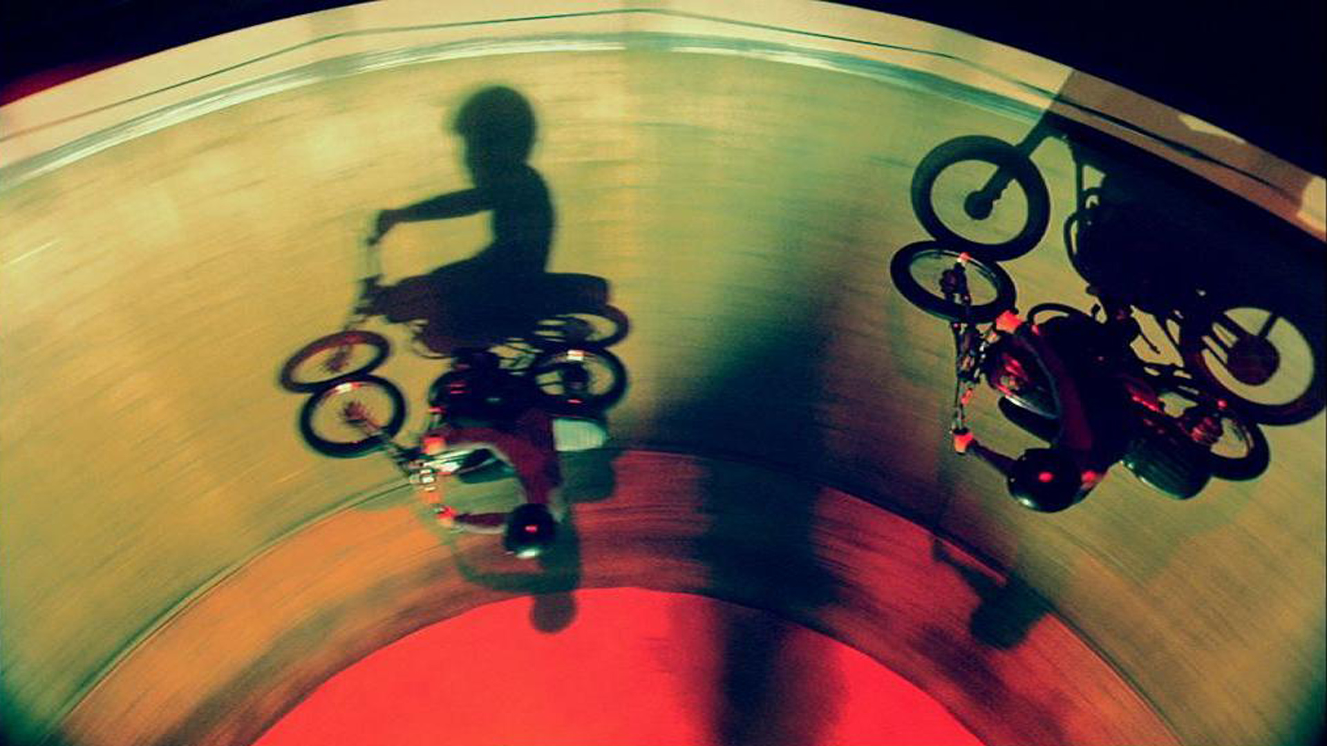
The circle was chosen as the central visual theme as a symbol of togetherness, depicting the idea that magical things happen when people come together. Eight idents were created, rich and complex to reward repeated viewing, using the colour red from the existing identity and a new logo and softer typeface were adopted.
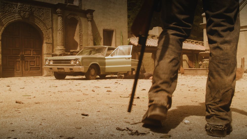
A collection of our favourite BBC One idents, all based on the visual theme of circles, representing unity and togetherness. Good things happen when people come together.
A christmas ident with everyones favourite timelord
The family favourites get caught up in some winter sport mayhem