
Loading

We created a new, digital-first brand identity for the BBC’s children’s channel, CBBC, with a mission to inspire the next generation of dreamers, innovators and creators.
Audience research revealed that while the CBBC name was well known, the audience did not know what the brand stood for. The problem was that our audience connected with the ‘what’ of the content, not the ‘why’ of the brand.
We saw the 6-10 year old CBBC audience not as passive viewers, but as the R&D department of the human race. CBBC kids are at the top of their game. They have an innate curiosity; their ideas and imagination know no boundaries. And, unlike many other kids’ channels, CBBC is loved by its audience because its content has a hidden goodness that they find inspirational.
For us, the context in which CBBC lives is crucial. As ‘always-on and digital-first’ it’s a given that the brand needs to flex across multiscreens. What distinguishes the channel from its competition is its realness: every day it engages with real kids in the real world. The proof is in the wealth of content covering everything from drama to comedy to news, all with a distinctly British feel.
Our strategy was to create a powerful relationship and coherence between the ‘what’ of CBBC - its content - and the ‘why’ of its brand belief: the uniquely inspiring content of CBBC sparks the imagination of kids to make real life more awesome.
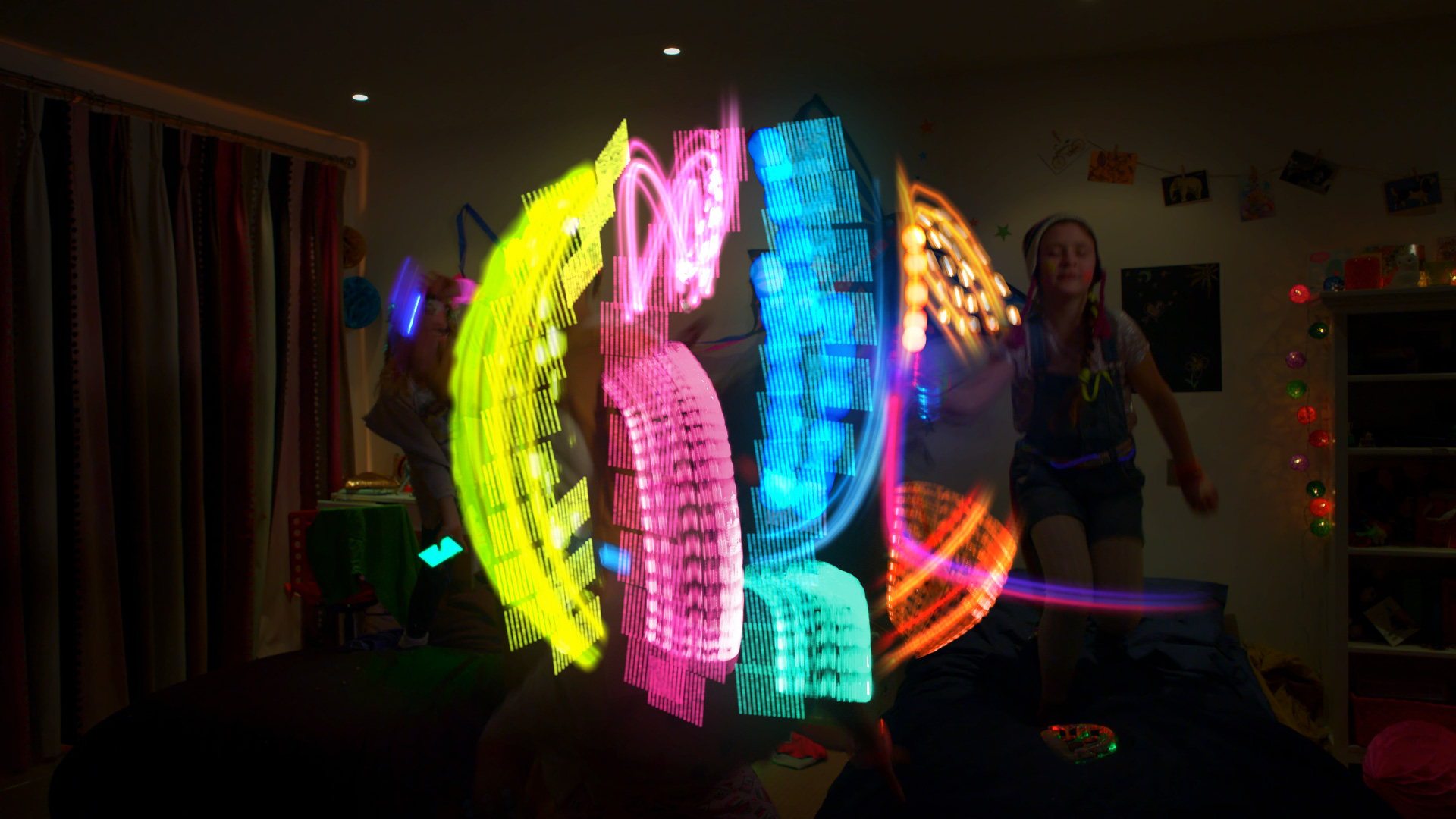
Idents are ordinary scenarios made extraordinary with kids’ imaginations. Want to read in bed? Make your duvet a book. Schoolbag too heavy? Use a Drone Butler, of course!
We also created a set of short logo idents. Well, the kids did the work.
The new logo unites the acronym of CBBC into a singular, cool marque that also solves the problem of duplication of BBC within the logo.
Its bold design ensures it works powerfully and responsively in a multiscreen world.
We gave CBBC a unifying brand movement which is reflected in the delivery of information throughout the OSP graphics.
Design patterns and the display of information take their cue from the brand marque to create a strong, cohesive and ownable look.
The most important thing is, do the kids care? So we asked them.
Exactly what we’d hoped. Thanks, kids.
“I like it!”
LIBBY, 9
“It looks cool!... I think the lines and the new symbol make it look better than last time.”
ELLIOT, 10
“The graphics are really good and made it more interesting to see and make you want to watch it a bit more.”
CHARLOTTE, 9