
Loading

A refreshed brand identity focused on driving credit back to the network masterbrand. Follows the successful ‘Together Unstoppable’ brand campaign.
As the leading Spanish-language broadcaster in the United States, Telemundo is recognised for redefining Hispanic media and content. Following our successful strategic and creative re-positioning of the brand, and the launch of the ‘Together Unstoppable’, we set to work on a new brand architecture and design system for the Telemundo network.
A key principle of the brand refresh was to continually drive attribution back to the masterbrand by aligning all sub-brands, genre brands and show logos under the hero Telemundo ‘T’ icon. The channel now has a stronger, more consistent presence across all touchpoints.
Taking inspiration from the original logo showing “two worlds coming together” and reflecting the audience’s shared Hispanic and American heritage, we gave the Telemundo marque a simpler, cleaner look to work impactfully in multiscreen environments.
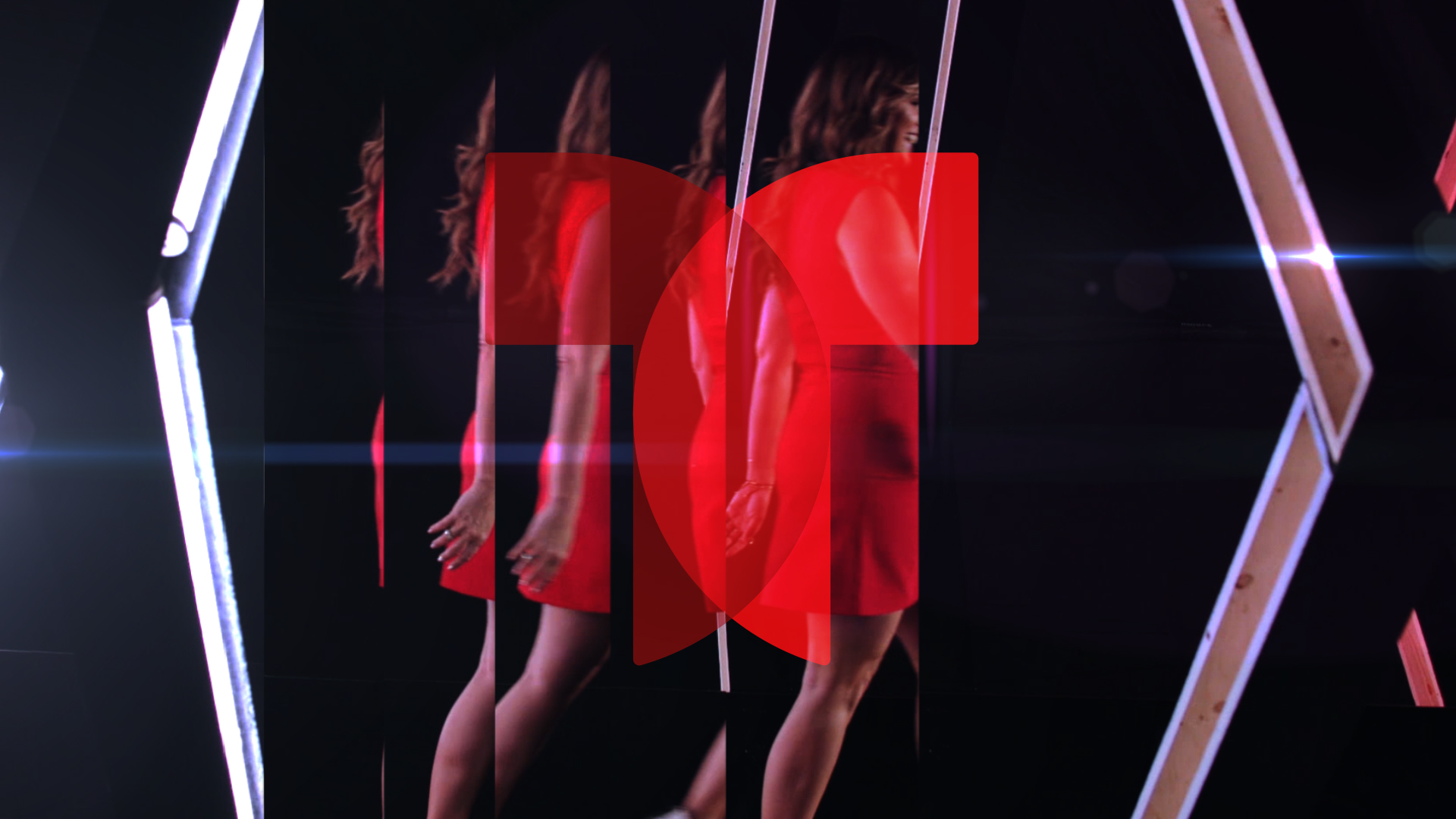
The new brand is relentless, dynamic and impactful. Brand visuals embody Telemundo’s strong sense of movement with an active identity that never sits still.
We introduced a new logotype and brand font, Foco and a refined colour palette that makes much stronger use of the brand’s heritage red.
All this comes together in a multi-functional brand that uses movement and energy, strengthening its brand presence to take ownership of its genre-busting shows.
Specially-shot idents, starring Telemundo talent, give the brand increased prominence on-air.
"Our brand refresh complements how we are redefining Hispanic media and keeping pace with the evolving consumption habits of today’s Hispanics. We set ourselves apart as the network that continues to defy norms and set a new standard in Hispanic entertainment with premium, original content across all platforms. Red Bee has captured all of that and more with this work."
Karen Barroeta, SVP, Marketing and Creative, Telemundo Networks