Move over Champions League...The UEFA Europa League is now a more iconic and grown-up looking brand thanks to a new logo, colour palette and bespoke font.
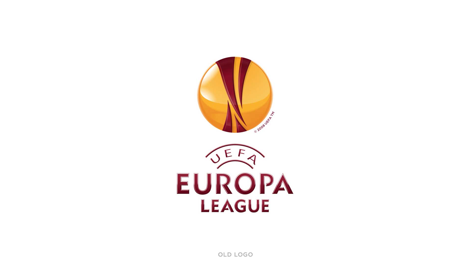
The previous Europa League logo and brand toolkit, created in 2009, was in need of a refresh. The brand marque did not carry the stature of the hero Champions League logo, the colours suffered in reproduction, and the logotype, featuring UEFA and Europa League typefaces, did not sit comfortably together.
We were tasked with creating a new logo for the brand in advance of the 2015-18 cycle.
A NEW, MODERN BRAND IDENTITY
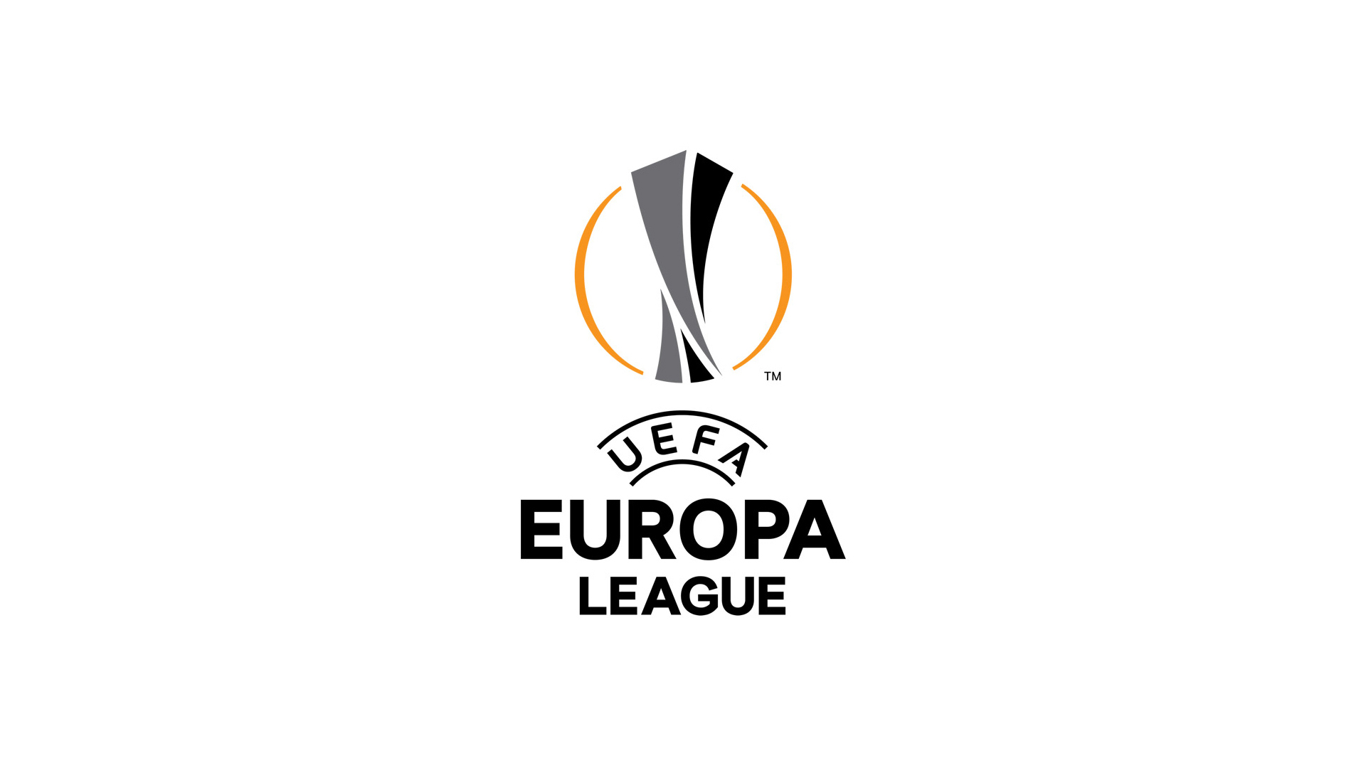
The Europa League trophy is the original UEFA Cup trophy and has been lifted by all the football greats. We wanted our logo to feature the league’s iconic trophy more powerfully.
We re-balanced the trophy shape, finessed the lines around the marque and gave our trophy the power to lift up and through the centre circle.
We also gave the logo a more modern look by dropping the glossy 3D finish and replacing it with a flat 2D marque.
Our colour palette for the brand was inspired by colours found in the Europa League’s famous trophy: the trophy lines are two tones of grey, taken from the reflective silver trophy outer. The orange halo around the trophy was inspired by the golden hue found in the interior of the real trophy.
We addressed the typography within the logo to increase impact and reduce the clash between the competing “UEFA” and “Europa League” character styles.
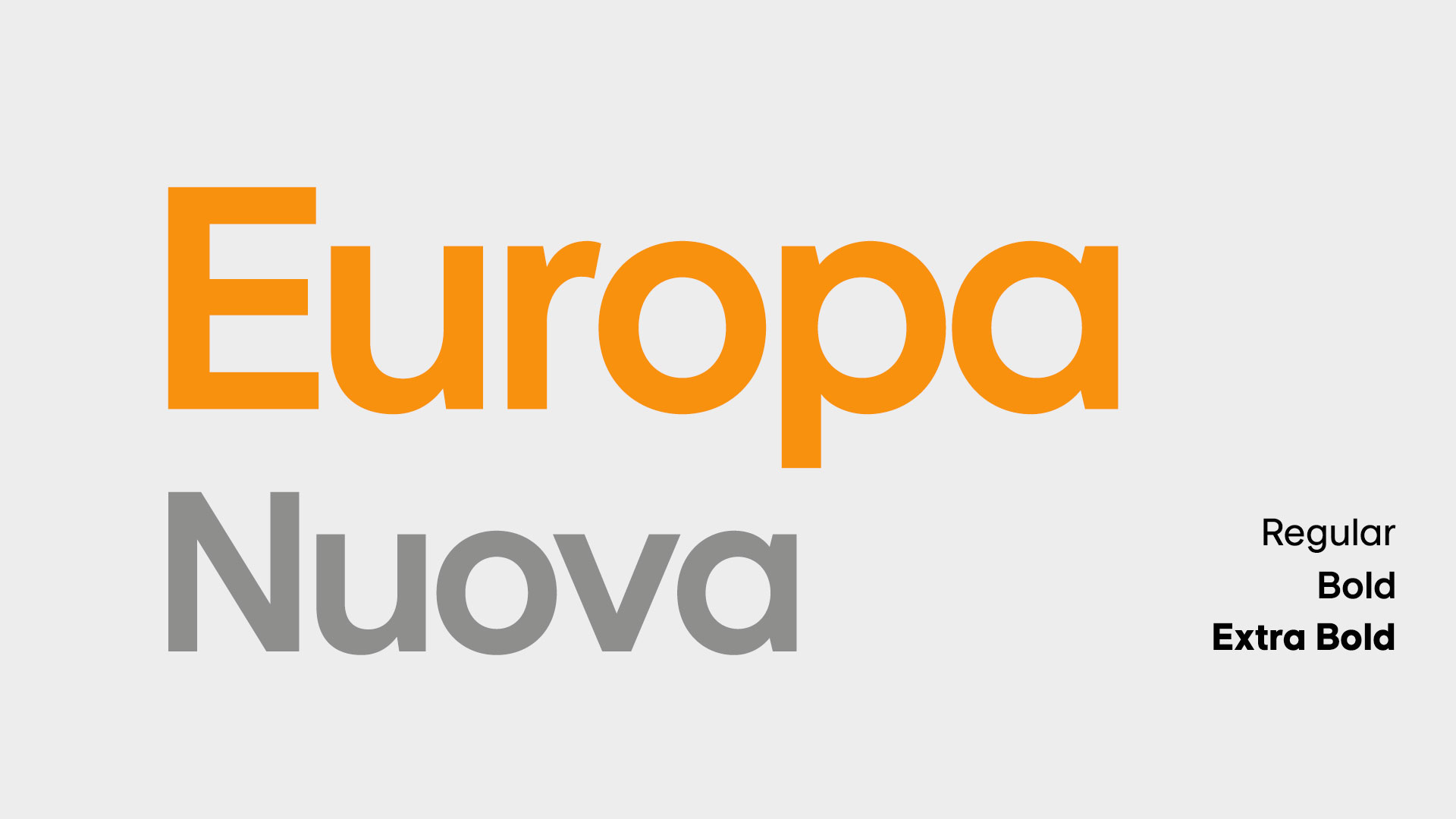
Bespoke Font
We worked with our font specialist partner to develop an entire bespoke font kit in multiple character sets and types. The font, “Europa Nuova” is used on all match graphics and branded material.

