
Loading

Our challenge was to retain Pinewood’s heritage and stature while also creating a brand fresh and flexible enough to meet the company’s ambitions for future growth.
As with any heritage brand, we wanted to capitalise on the equity already held in the identity. For Pinewood this meant we wanted to retain the word marque, spotlight icon and Pinewood green while adapting them into a more flexible, fit-for-purpose and contemporary identity.
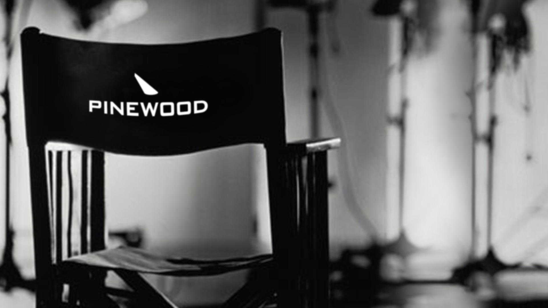
The first step was a logo re-draw with a sharper, clearer spotlight icon. We liberated the logo marque and spotlight from the rectangular lozenge to allow for a more flexible brand application and gave clear rules about how to apply the spotlight across different backgrounds.
The corporate brand elements, including letterhead, reports, business card and PowerPoint templates, were designed as a modern interpretation of the Pinewood legacy brand look, incorporating the classic Pinewood green.
We had a mantra that anything that was standard marketing collateral should feel special and - where possible - be a memento or collectable item that visitors and staff are excited to hold onto.
A fresh secondary palette, new graphic property and logo pattern give Pinewood more freedom to use their new brand in a highly functional, clear and refreshing way.
A logo animation, with a nod to Pinewood history, sits proudly alongside any Pinewood assets.
Pinewood are delighted with their smart new brand and we are working together with them to assist the global rollout.