
Loading

Articulating a brand’s purpose and bringing it to life in a new audience-facing brand campaign.
Our challenge was to make the British public understand that Soccer Aid for Unicef isn’t just a celebrity football match; that it is a charity that exists to raise money for children through Unicef.
We were tasked with developing a creative platform that would promote both the landmark family entertainment event on ITV and also, importantly, rally support for the children that Unicef works tirelessly to help. The crux of the challenge was that while the British public knew what Soccer Aid was: a pro-celebrity football match on TV, over half of them didn’t know it was for a good cause. They didn’t know why Soccer Aid existed, why it was deserving and why they should care.
We placed Article 31 of the United Nations Convention on the Rights of the Child at the heart of the Soccer Aid for Unicef brand: "Every child has the right to relax, play and take part in a wide range of cultural and artistic activities."
Play isn’t just about having fun. Play is fundamental to a child’s development. Soccer Aid for Unicef aims to remove and alleviate violence, exploitation, poor sanitation, disease so that children can survive, thrive and ultimately play, through education, health care, safety, security and community.
We wanted audiences to understand ‘the why’ behind Soccer Aid for Unicef.
Our strategic proposition stated it simply: We play, so they can play.
The campaign strategy was introduced throughout campaign communications, including the TV ad to launch this year’s event, produced by Soccer Aid Productions and ITV, starring Dermot O’Leary.
We enhanced the colour palette to include the use of brighter colours allowing communications to pop out and have a greater sense of fun.
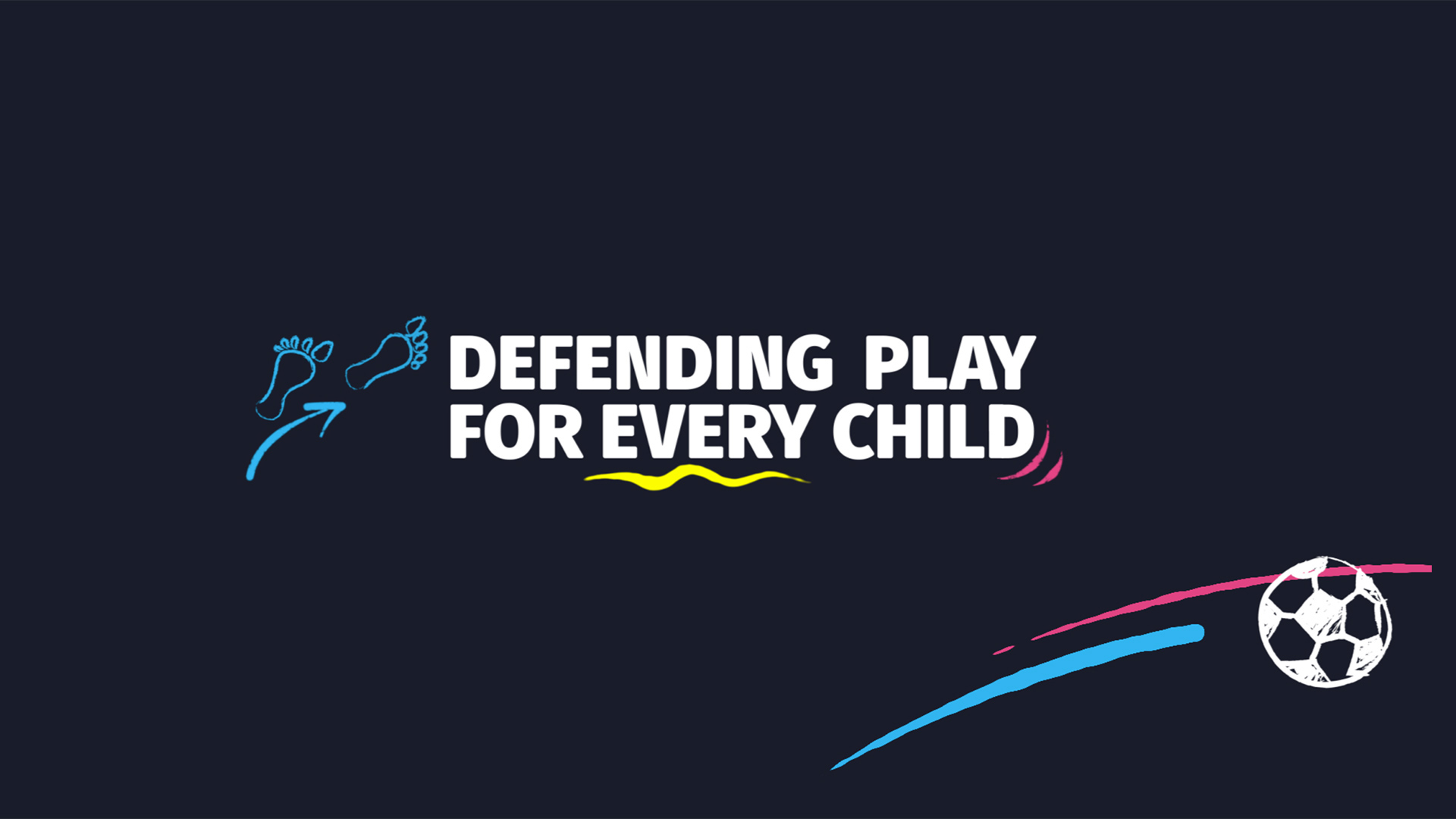
Inspired by football tactic boards and children’s playground markings, we developed a new brand property to inject some warmth into Soccer Aid’s visual identity kit. The new brand doodles are a flexible and playful addition to the brand’s campaign look.
The doodle design encourages movement and playfulness, across both static and moving footage.
“Right from the start we were really impressed with Red Bee’s thinking and creative approach to our brand. The team just got it and it was clear they cared as much about our brand as we do. We’re so excited to see our new strategy and brand look come to life and roll out fully.”
Sarah Martin, Director of Soccer Aid for Unicef